Data visualization is a process in data analytics where visual representation communicates the data and insights to facilitate good data-driven decisions.
Basically, data visualization is communicating data and insights, in part or whole, using charts, color, text, ergonomics and other related aspects. While a well-crafted data visualization can make the communication pertaining to data and insights more effective, a poorly generated data visual can lead to faulty interpretation, incorrect decisions and, ultimately, poor business results.
So how can one create a good visual of data and insights? What are the key rules or best practices? In this article, I’ll explain the five key commandments of data visualization.
1. Purpose drives the visual.
The first commandment of data visualization is to define or identify the purpose—i.e., what to visualize or show. Purpose comes from knowing your stakeholders and their objectives. What kind of business questions do they care about? What decisions are at stake? What is the measurement entity that drives performance management?
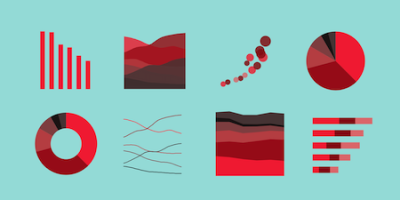
As explained in this Edraw article, every data visual has one of the five key objectives—distribution, composition, relationship, trend and comparison.
Distribution: The visuals show how items are distributed into different parts. The best charts to depict the distribution of data are line charts, histogram charts and scatter charts.
Composition: Pie charts and stacked charts are designed to show the compositions of the data.
Relationship: The relationship of one data variable to the whole group or other variables can be best visualized using scatter plots and bubble charts.
Trend: When you need a chart for indicating the trend of a series of data in a time period, a column chart and line chart are recommended.
Comparison: To compare data sets, bar charts and spider charts are often used.
2. Data type determines the selection of the visual.
The selection of visuals is based on the data type. There are three types of data: nominal, ordinal and numeric. In a sales order, for example, customer name, product identifier and order type are nominal or categorical data; payment terms and delivery priority that can be ranked are ordinal data; and sales amount and item quantity are numeric data.
Histograms, for example, can depict data that is measured on a nominal or categorical scale. If the data variable type is ranked, a bar chart can be used. If the data type is numeric, box-and-whisker plots and line charts are good options to visualize those numeric variables.
3. Less is more in data visualization.
Data visualization enhances communication to make good decisions using the relevant data and insights. Hence, one should identify the necessary variables and select the visual that will help communicate the data in a clear manner. Keep it simple.If a pie chart compares more than seven entities where each of the pie or sectors is not very distinct, it will be difficult to see the differences between the measurement entities.
This commandment can be managed using two KPIs: data-ink ratio and data density.
The data-ink ratio, as Speedwell explains in the “The Manifesto of the Data-Ink Ratio,” is “the proportion of Ink that is used to present actual data compared to the total amount of ink (or pixels) used in the entire display.” Generally, you want a higher amount of data compared to ink (or pixels). A high data-ink ratio can be achieved by removing graphics such as 3-D effects, background images, borders, grid lines and so on that could be unnecessary.
Data density is a measure of how much information can be stored in the display space. Data density essentially says: Don’t use a large visual to show a small amount of data.
4. Apply consistent scales.
If the chart or visual is meant to show the difference between data variables, as Kaggle explains, then
The lie factor can be used to measure consistency in scales. The lie factor KPI measures the relationship between the size of the effect shown in a graphic and the size of the effect shown in the data.
For example, say the actual sales data changes from $20 million to $30 million, but graphically it varies from 0.8 to 5.7. While the actual change in revenue is 1.67 (= 30/20), the graphical one is 7.13 (= 5.7/0.8), and the resulting lie factor is 4.3 (= 7.13/1.67). This is not acceptable, as the recommended lie factor should be around 1.
5. Aesthetics matter.
Aesthetics—the use of the right visual size, typography, flow and color—can significantly bolster data visualization. Some recommendations include the following.
Apply the golden ratio (1:1.618), the proportion at which different-sized elements are found to be the most aesthetically pleasing for human eyes.
The recommended typography is sans serif (such as Trebuchet) for headings and serif (such as Georgia) for details.
The positioning of the visual object should mimic the way people read: The “F” pattern, starting at the top of the page, moving across it and then down.
Too many colors can be confusing. Stick to about five colors.
Strive for the 60-30-10 color rule. For example, in a line chart: The base/chart can be the primary color (~60%), the data can be the secondary color (~30%) and the trend line can be the accent color (~10%).
Contrast colors and shades to better distinguish the differences. This can also help colorblind viewers.
Conclusion
They say a picture is worth a thousand words, and the human brain processes data and insights using charts or graphs much more easily than spreadsheets or reports.
Data visualization is not about creating stunning and colorful dashboards and infographics; the main purpose is to facilitate effective communication for improved decision making. The five key commandments of data visualization discussed here can help one create a good visual of data and insights to support data-driven decision-making.
As Edward Tufte, the pioneer of data visualization is credited with saying: “The essential test of design is how well it assists the understanding of the content, not how stylish it is.”
Prashanth Southekal is the Managing Principal of DBP-Institute, a Data Analytics consulting and education firm. He has consulted for over 50 organizations including P&G, GE, Shell, Apple, and SAP and solved problems that are at the intersection of data, technology, and business productivity. He is also an Analytics Advisor for SAS-Institute (Western Canada), Evalueserve (Switzerland) and Grihasoft (India). Mr. Southekal is the author of 2 books - Data for Business Performance and Analytics Best Practices. Apart from his consulting pursuits, he is an Adjunct faculty of Data Analytics at University of Calgary (Calgary, Canada) and IE Business School (Madrid, Spain). He has a PhD from ESC Lille (FR) and MBA from Kellogg School of Management (US). He lives in Calgary, Canada.